Goal
Brand redesign (with the existing color palette) and user interface design for a responsive website -content-heavy- for The Community Guide, an online guide to provide health-related findings to Communities in general.
Branding • Logotype • UI Style Guide • Pattern Library Foundation • UI Kit for Responsive Website
Branding • Logotype • UI Style Guide • Pattern Library Foundation • UI Kit for Responsive Website
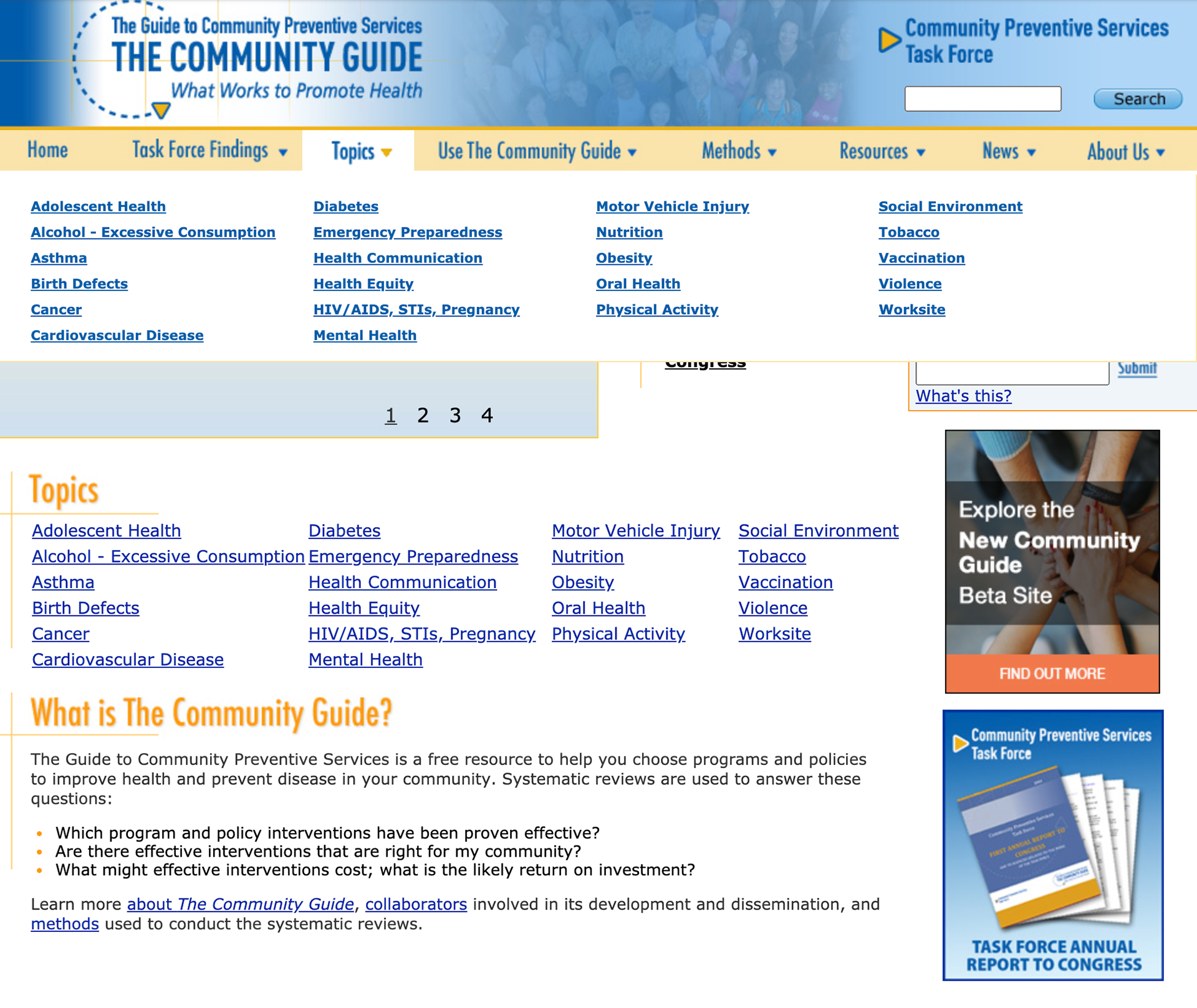
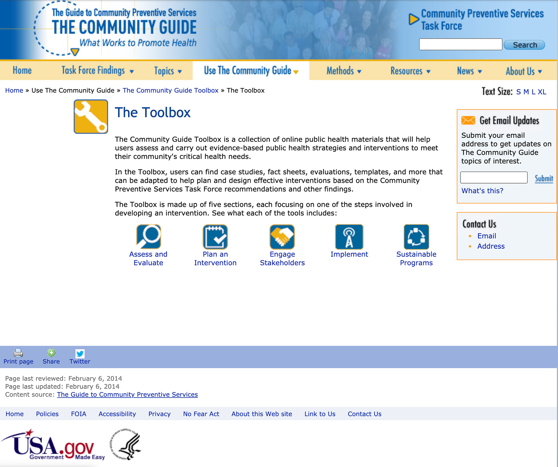
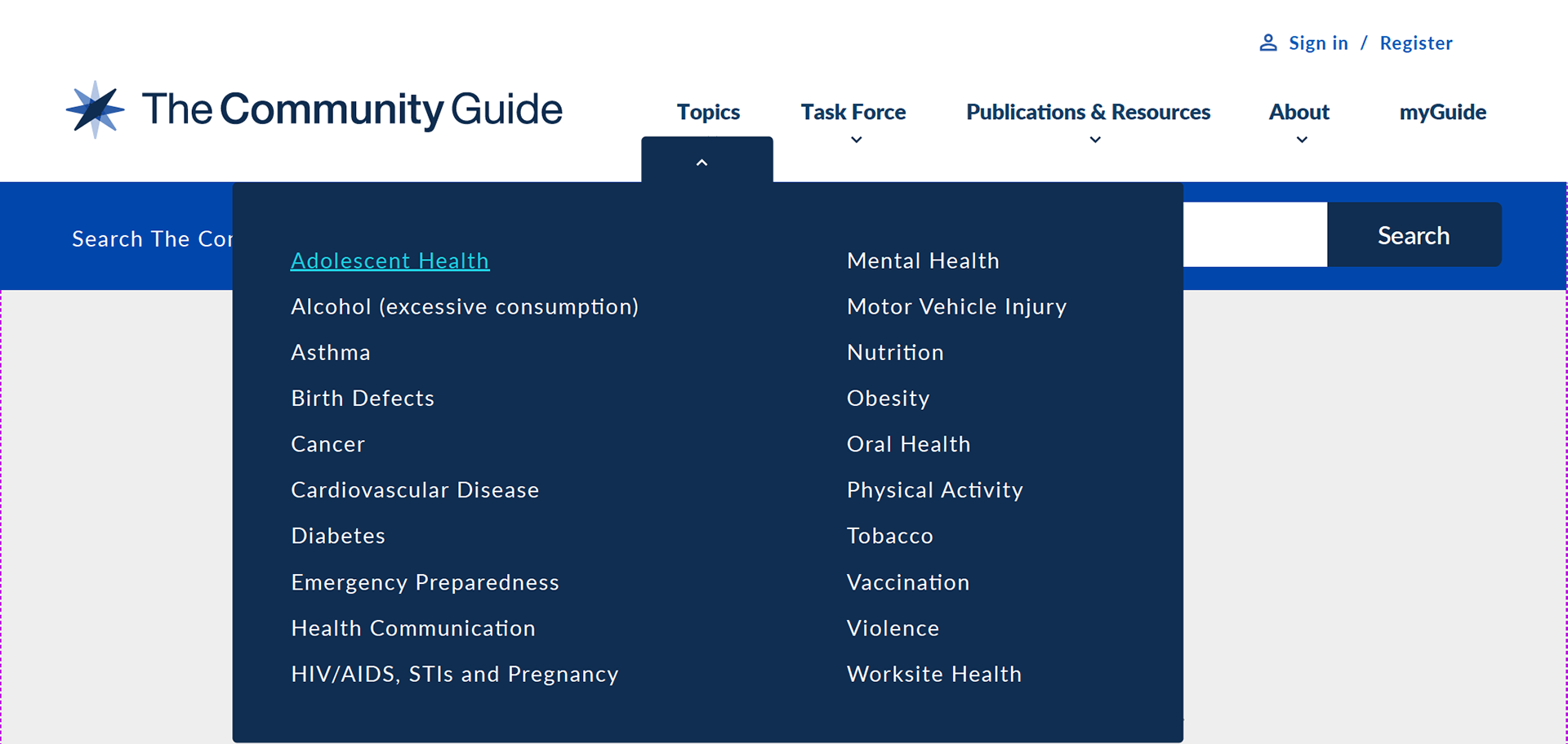
AFTER REbrand

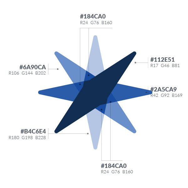
The cornerstone of the visual identity for The Community Guide is the abstraction of a COMPASS. This compass acts as a visual metaphor that provides a sense of direction or guide. The modern sans serif typeface integrates harmonically with the lockup and has good readability.
PATTERN LIBRARY FOUNDATION / UI KIT

Desktop Default Navigation
Desktop Drop Down Style
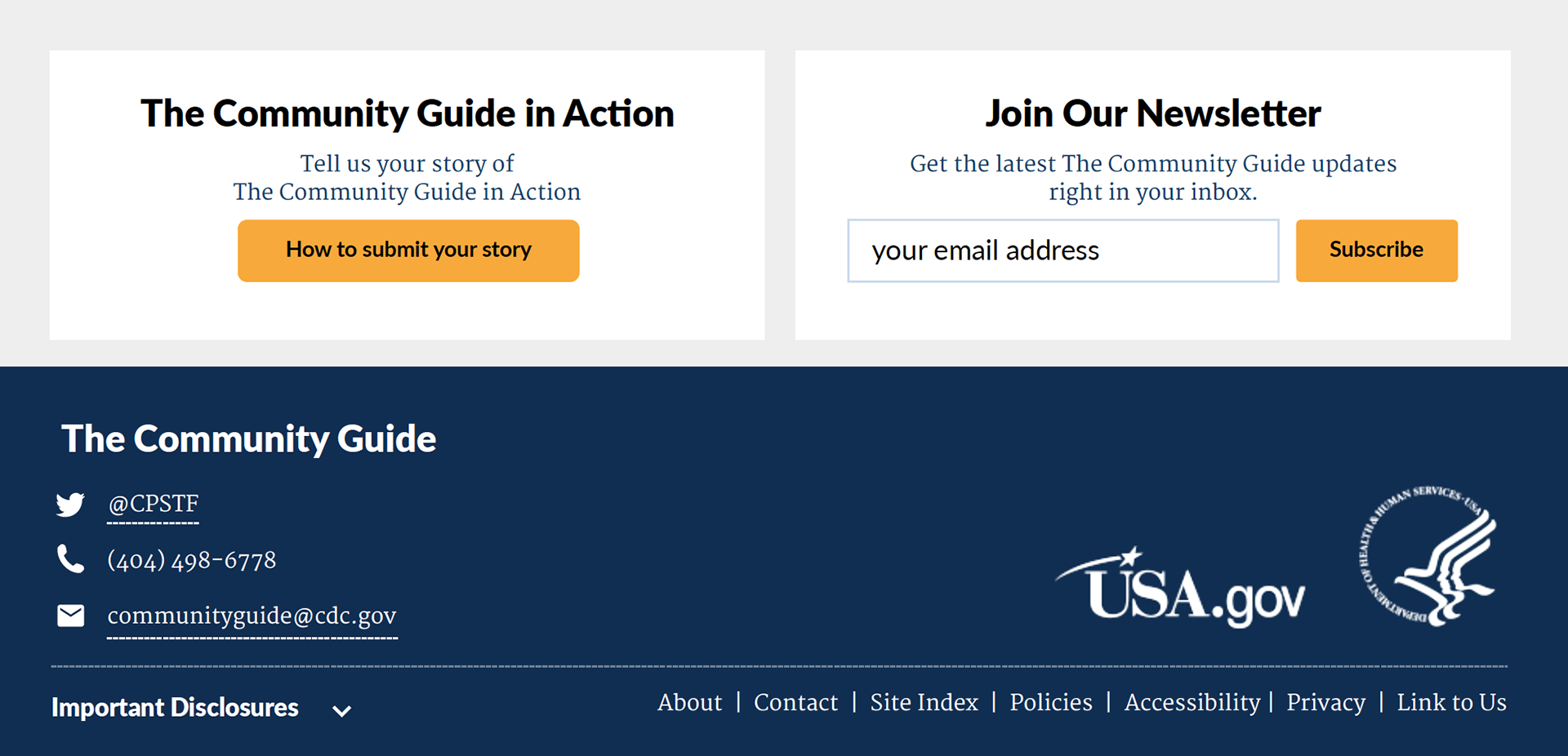
Desktop Footer
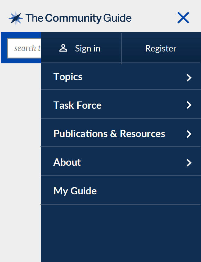
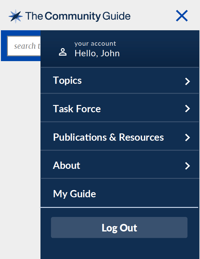
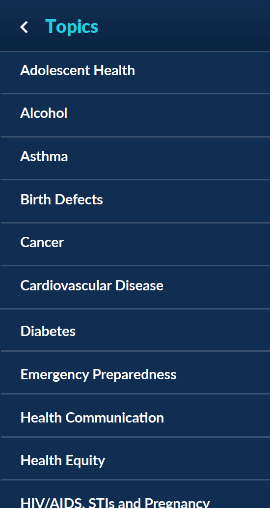

Mobile Hamburger Navigation, Logged in, 2 tier navigation menu, Footer
COLORS
Primary Colors
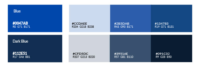
The brand colors are blue and navy blue, commonly associated with trust, confidence, and responsibility. It promotes physical and mental well being. This palette is used as the primary brand colors across various design elements, including headers, text, links, and background colors.
Secondary Colors
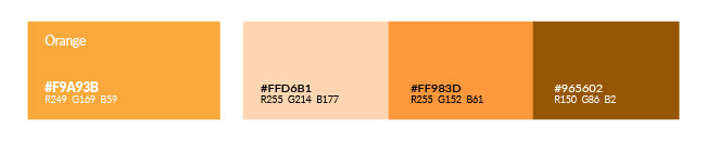
Orange relates to acquired knowledge. It creates enthusiasm for life and can awaken greater confidence and optimism, offering hope. This palette provides additional lightness and style to pages. The palette should be used to highlight important features on a page, such as primary call-to-actions, or for high-contrast elements that need to stand out on a page. They should be used sparingly and never draw the eye to more than one piece of information at a time.
Colors
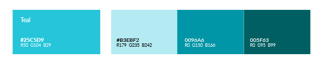
Teal enhances the primary blue color palette adding subtle variation to a cool color scheme. It inspires good communication. This palette is used primarily for content-specific needs, such as alerts and illustrations. It should never overpower the primary colors.
Background Colors
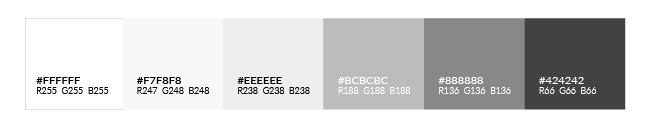
These colors are used largely for background blocks and large content areas. When alternating between tones, be sure to use enough contrast between adjacent colors.
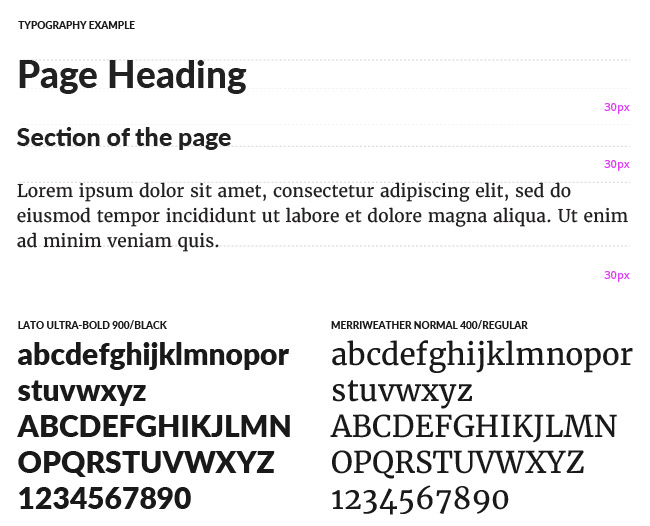
TYPOGRAPHY
BEFORE rebrand